
Changelog
Follow up on the latest improvements and updates.
RSS
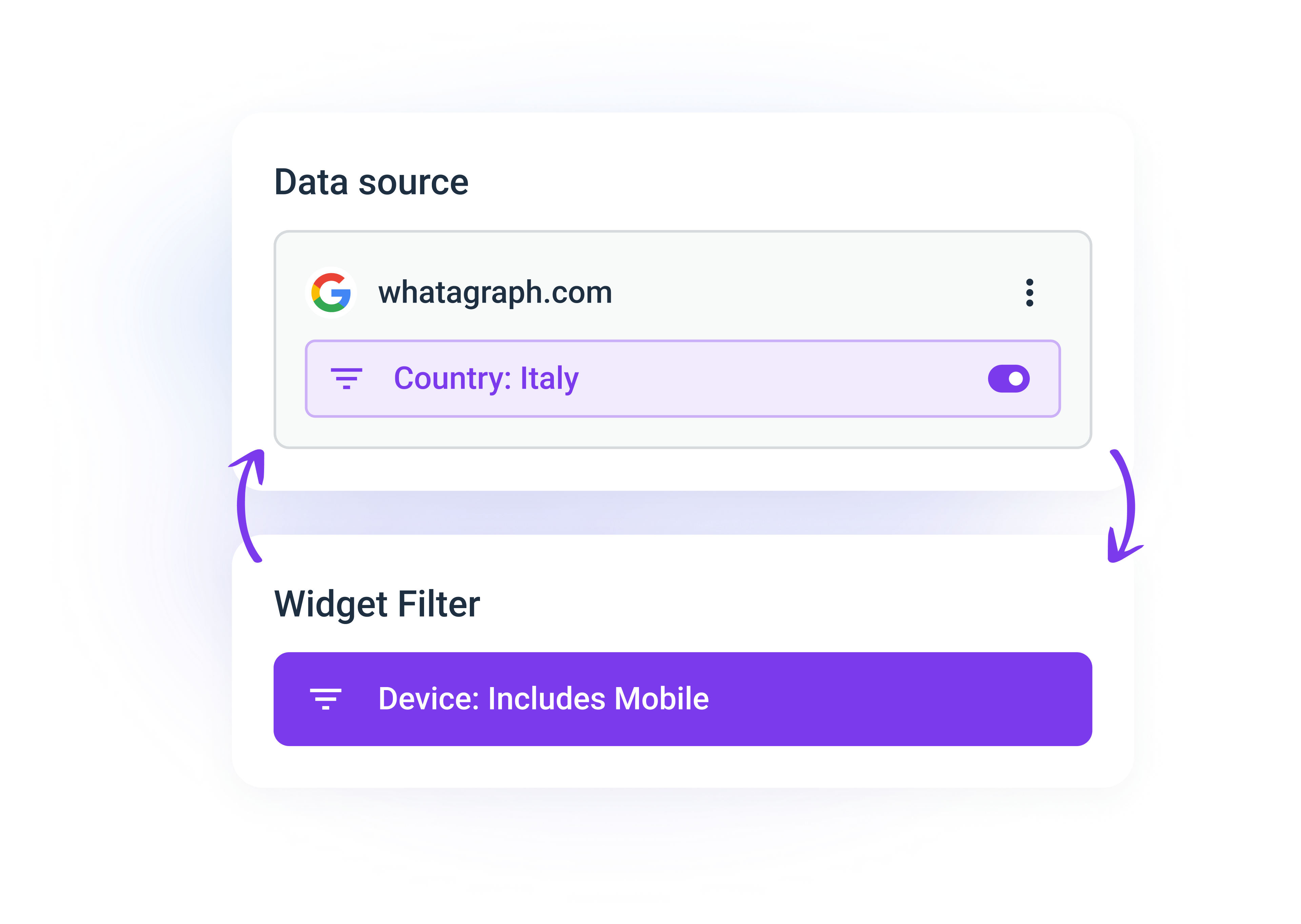
Previously, working with source and widget-level filters simultaneously in the same report could sometimes be cumbersome. Source-level filters would override any widget-level filtering.
We launched an update that helps you navigate the report filters with ease.
The most important part is that you can now combine filtering on the source level
(all the data coming from a source) with more specific filters applied to a single widget.
Here's how it works:
- First, in the widget settings, you can choose if a source-level filter will be applied. This means you can exclude some of the widgets from the source-level filtering.
- Then, if you leave the source-level filter on and add another filter to a widget, they will work together.
- You can also duplicate your sources and apply filters to them without leaving the sidebar.
Here's a brief video walkthrough:
Note
: If you already had widgets with both source and widget-level filters applied, you will have to manually reapply the widget-level filter after the update for this to work correctly. Our support team is always available in the Live Chat for any questions.
improved
UX/UI
Data comparison in a table summary row
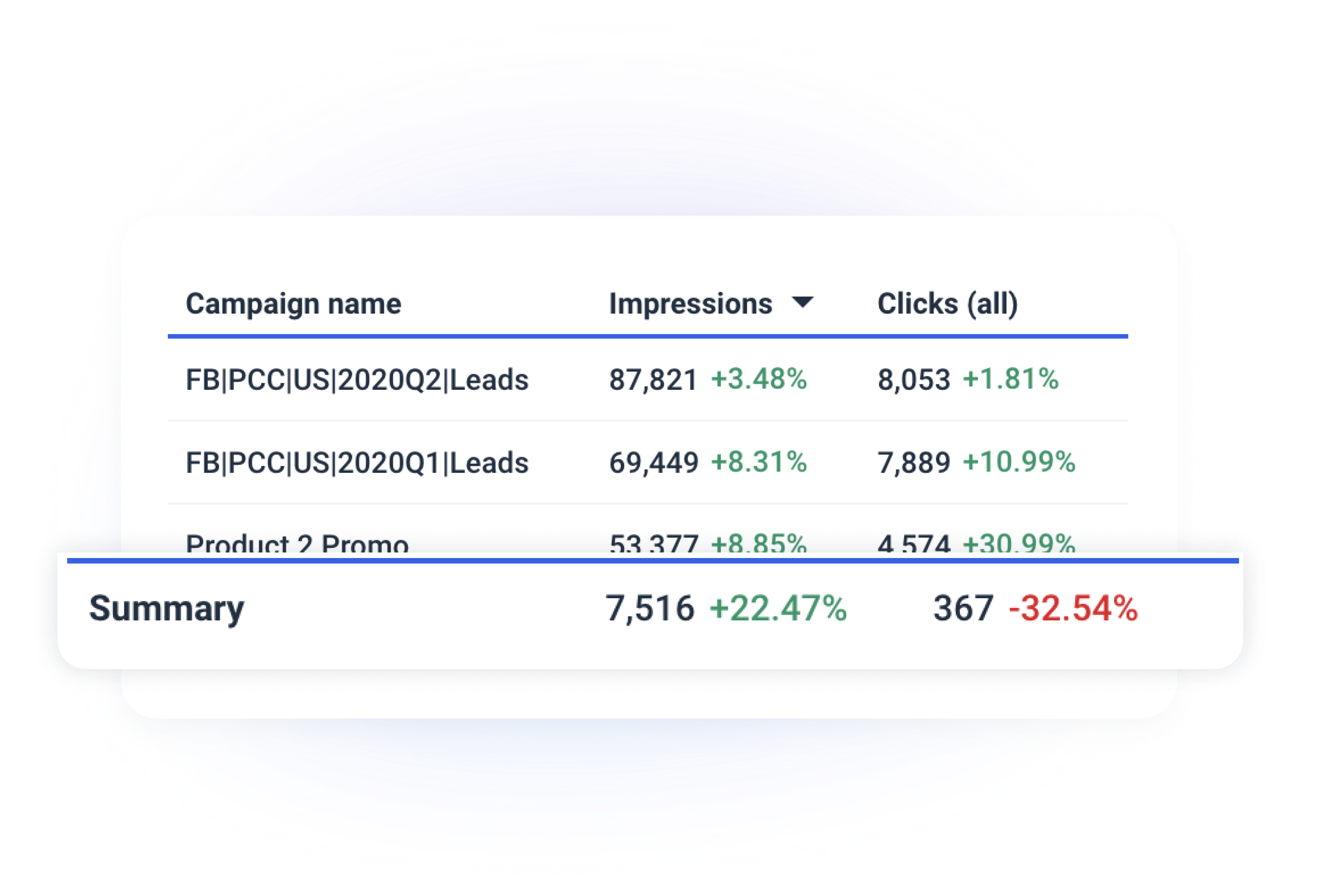
Previously, when you enabled the "Compare to the previous period" setting in your reports and dashboards, table summary rows were unaffected.
With this update,
you will also see how the totals changed over time in the summary rows
. This is turned on by default in all tables with the summary row enabled after you pick a date range for data comparison in the report (or widget) calendar.
Let us know if you have any questions or feedback in the Live Chat.
improved
Features
UX/UI
Adding Data Labels to Charts
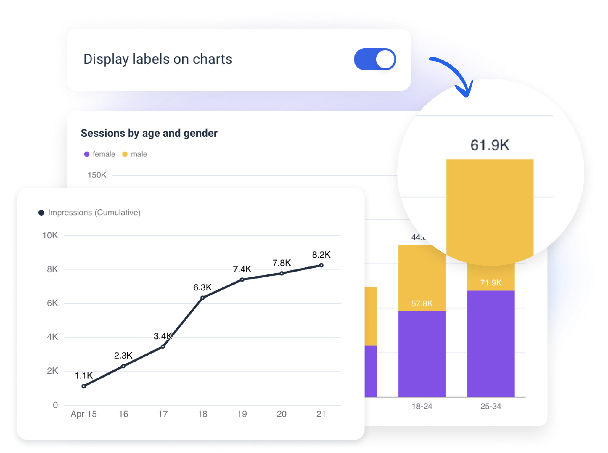
Your reports and dashboards can now include data labels in graphs and charts
. The setting to display data labels has been added to every chart widget. This highly requested update is especially handy to make what you share with clients or stakeholders easier for them to understand, read, and navigate.
How it works:
- Drag and drop any chart-type widget to your report (e.g., line, graph, bar, pie charts).
- Click on the widget to open settings in the sidebar.
- Select a toggle that says "Display labels on charts."
Let us know if you have additional feedback or questions in the Live chat.
improved
Features
Improved source connection process
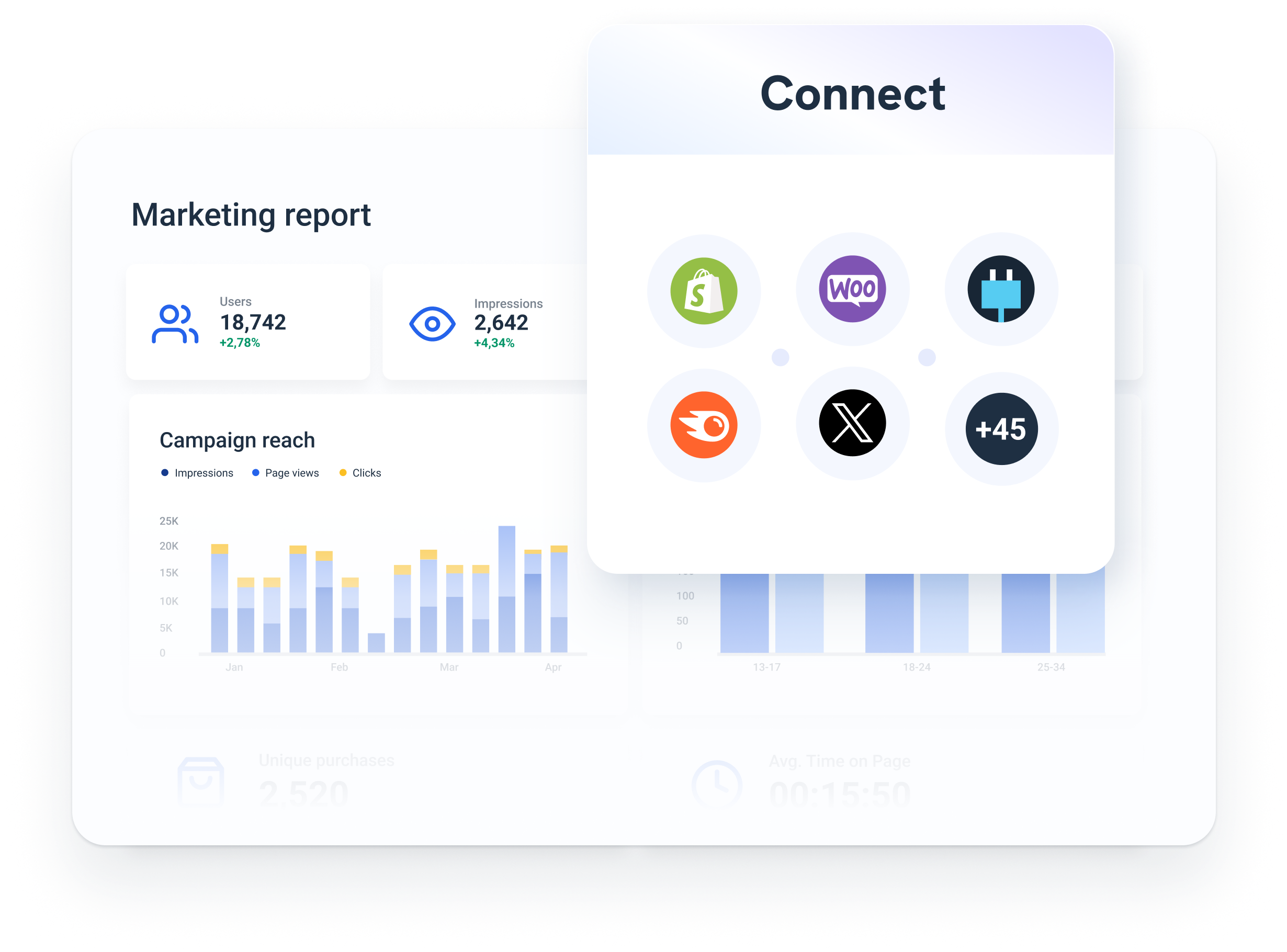
This minor update will enable you to save even more time working with your data in Whatagrpah.
We improved
the source connection experience when it's done from within a report.
Now, you don't need to switch from the report-building environment to the Source Management and back for any new sources you'd like to add. Even with sources like Ahrefs that require inputting additional information to establish the connection, it's all done seamlessly.
Try adding new sources from the "Sources" tab in your sidebar to check it out. Let us know if you have any feedback or questions on this updated flow.
new
Features
Rename sources on the report level
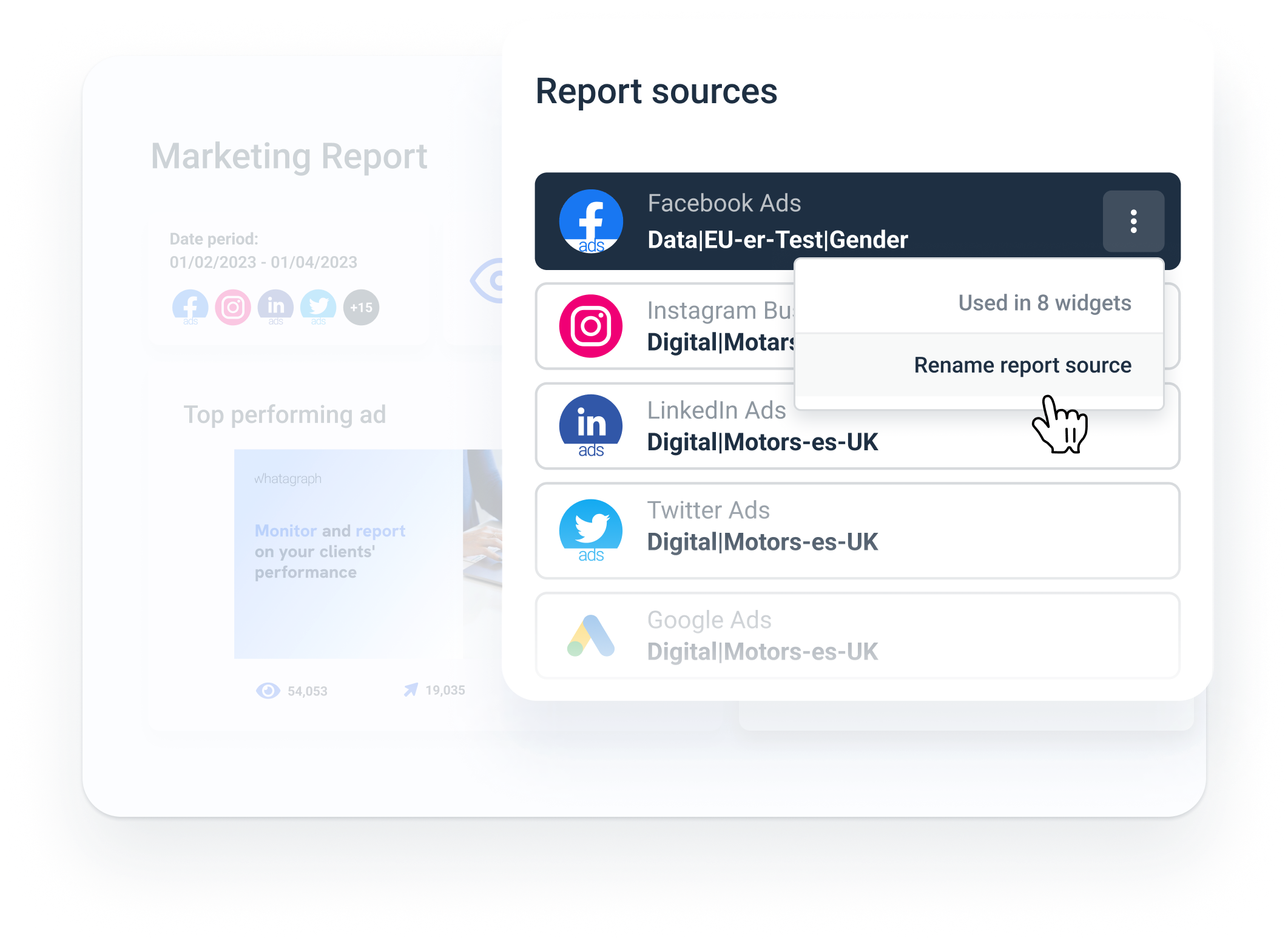
With this update,
you can change the source names
in your report or dashboard. Previously, source names would be fetched as they are in the API. And those were the names you would see in your widgets.
The most noticeable example is the multi-source tables:
Instead of having a list of pre-defined names for multiple websites, social media groups, or paid ad sources, you can rename them for clarity now.
For example:
- Rename multiple ad accounts connected to the report and clarify what they are for.
- Update the source name if a source-level filter is applied.
- Change internal naming to something more straightforward for your end reader.
To do that, press on the three dots near any of the connected sources in the "Source" section of the sidebar.
Please note:
Changing the source name will affect only a specific reportimproved
Features
Duplicate multiple widgets at once
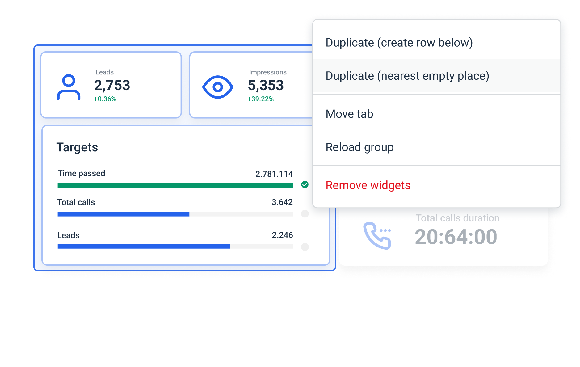
Duplicating multiple widgets at once has been a highly requested update for Whatagraph.
Now, it's possible to duplicate as many widgets as needed as a group
in your reports and dashboards.You can create a copy of an entire report page or repeat just a few widgets a couple of times when necessary.
Here is how it works:
- First, you select multiple widgets holding CTRLorCMD.
- Then, press on the three dots to open the actions menu.
- You have two options: duplicate to the nearest available space, or create new rows below the selected group.
Voila! You will see the same widgets appearing on the page with just one click.
Our support team is always available in the
Live Chat
for any questions. Today, we are launching
the expansion for Whatagraph
that includes: - Completely new environment called "Organize."
- Opening "Data Transfer" for all teams for a limited time upon request.
- Introducing "Source credits."
This marks the transition of Whatagraph to become a truly one-stop marketing data platform.
The "Organize" feature
Our goal is to enable you to do more with siloed marketing data incoming from all those sources.
In other words, get insights faster, make your reports and dashboards more consistent and easier to analyze, and improve client or stakeholder engagement.
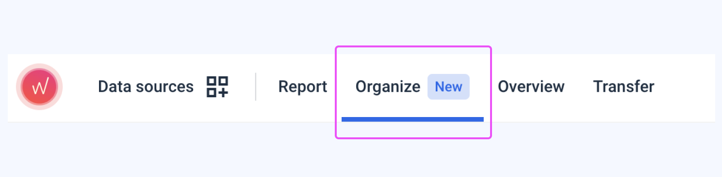
The new "Organize" environment that you will see in-app
allows you to perform additional actions with your data on the source level:
aggregate, unify, group, blend, and create custom metrics and dimensions.Watch the walkthrough video above and visit our Help Center to check out the use cases.
Please note:
You can explore the full capabilities of "Organize" for 30 days after you click "Try it for free."
After that, pre-made data organization will remain available, while custom options are included in our new Advanced and Custom plans.
- - -
Access to the "Data Transfer"
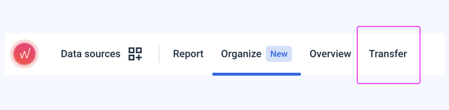
In Whatagraph, you can
easily set up data transfers from a marketing source to your BigQuery warehouse
. You can choose data sources already connected to Whatagraph without additional setup or configurations, pick metrics and dimensions (schema), and schedule automated data flow to the warehouse.
Using BigQuery as a source connected to Whatagraph, you can instantly validate how the transfer is executed in a table widget or visualize data if needed.
Upon request, all teams can now use Data transfer for 30 days; after that, it will be included in the new Whatagraph plans.
- - -
Source Credits
Finally, we are introducing a new unit to expand your flexibility in using Whatagraph.
The data connection process remains entirely the same. Still,
source credits give you more opportunities to leverage other parts of our platform.
You can use them for: - Creating data blends in "Organize."
- Setting up Data Transfers to BigQuery (1 source credit per table in the warehouse).
- Connecting new sources.
Here is an article explaining Source credits in depth.
improved
Features
New icons in the library
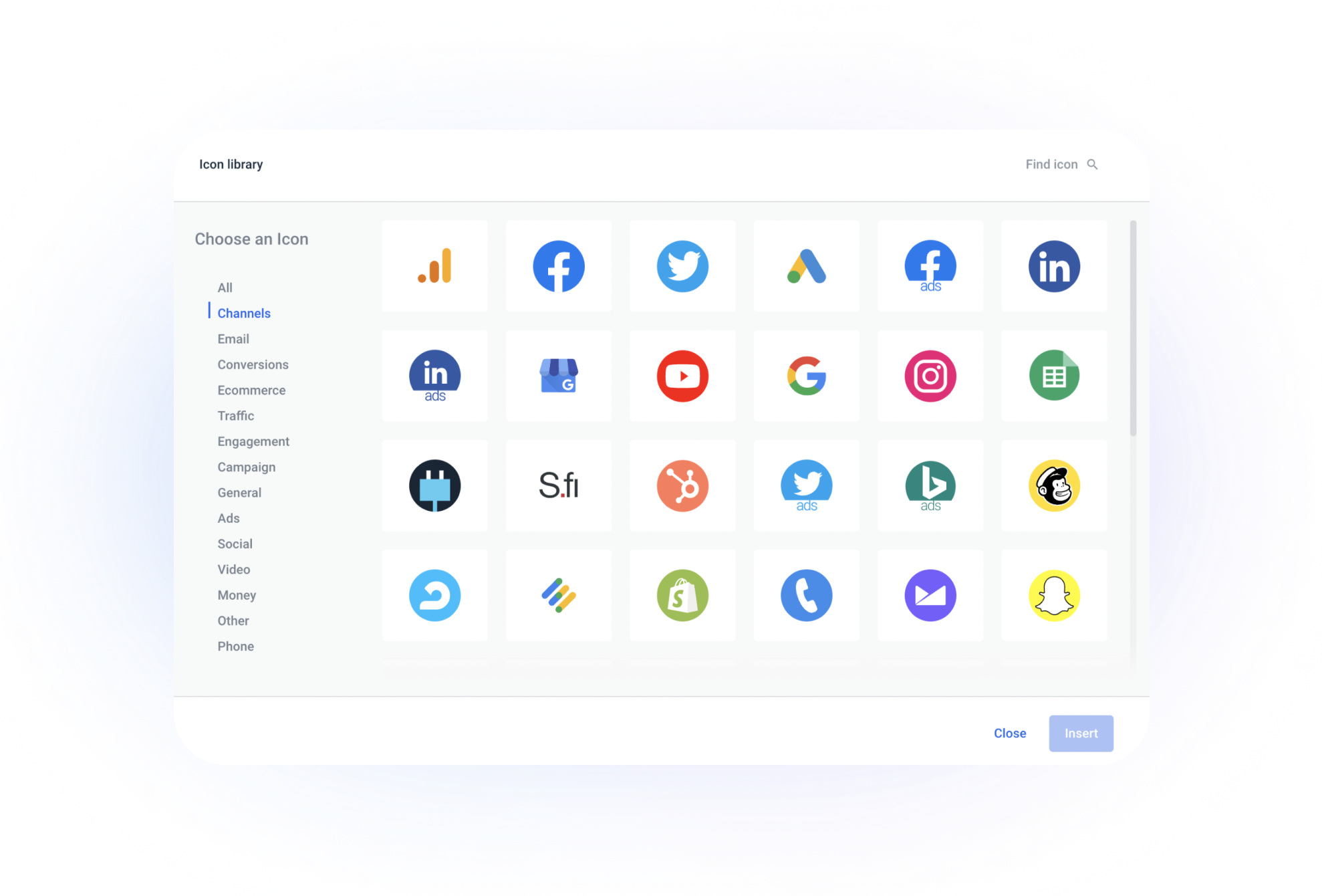
A minor but highly requested addition to the Whatagraph icons library!
You can now
add marketing sources' logos to your Single-value and list widgets,
like other icons before. To do that, click on three dots near the widget on the report grid or go to the "Metric" field in a widget's settings.
Stay tuned for more icon customization updates coming soon.
new
improved
Features
Widgets update! New architecture, dimensions as columns, and so much more
There has been a massive update to how widgets work in Whatagraph. For now, you will notice just a few things:
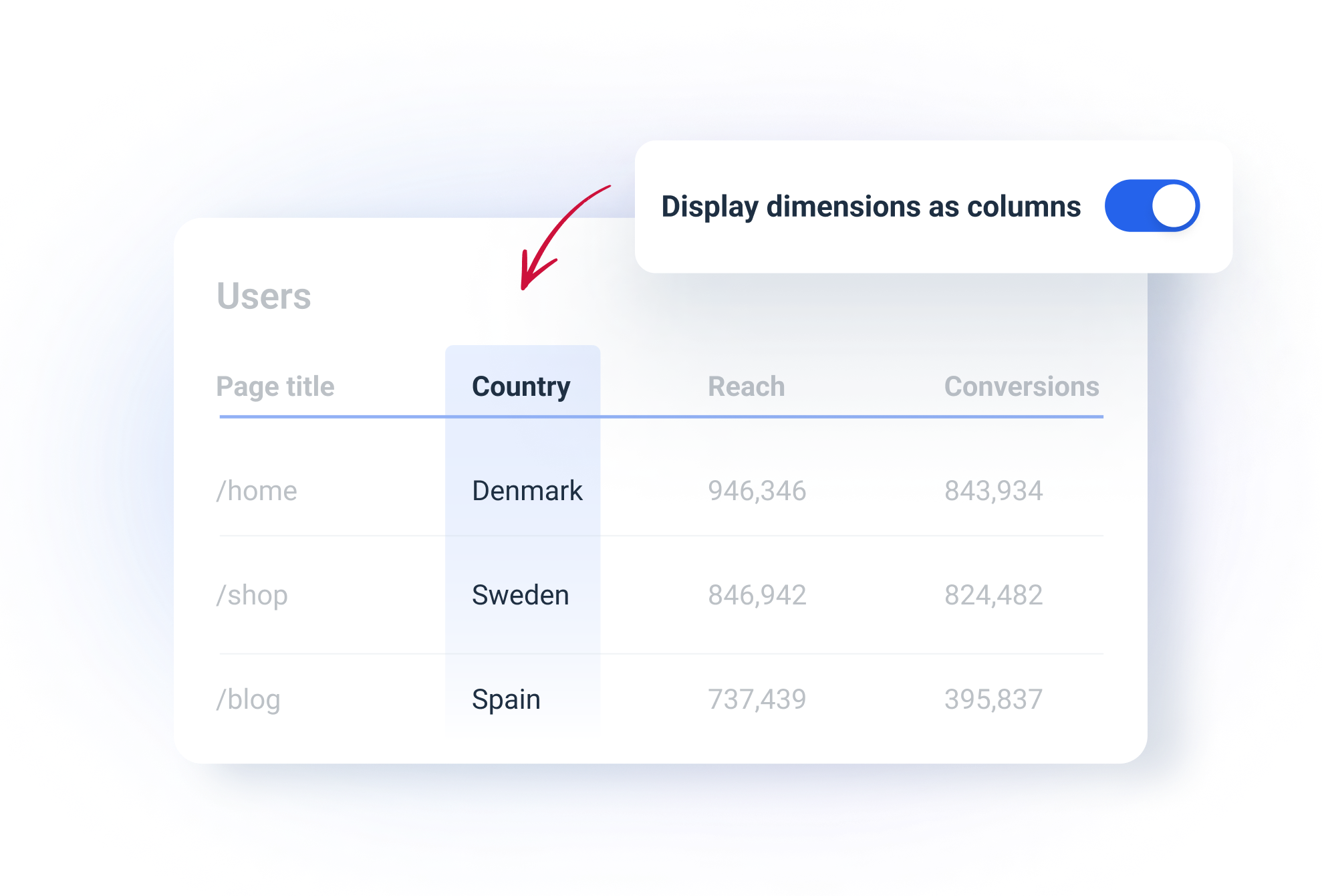
- Dimensions are now set as columnsby default in table widgets. That makes the tables much easier to analyze, read, and present. You can turn this on and off in widget settings.
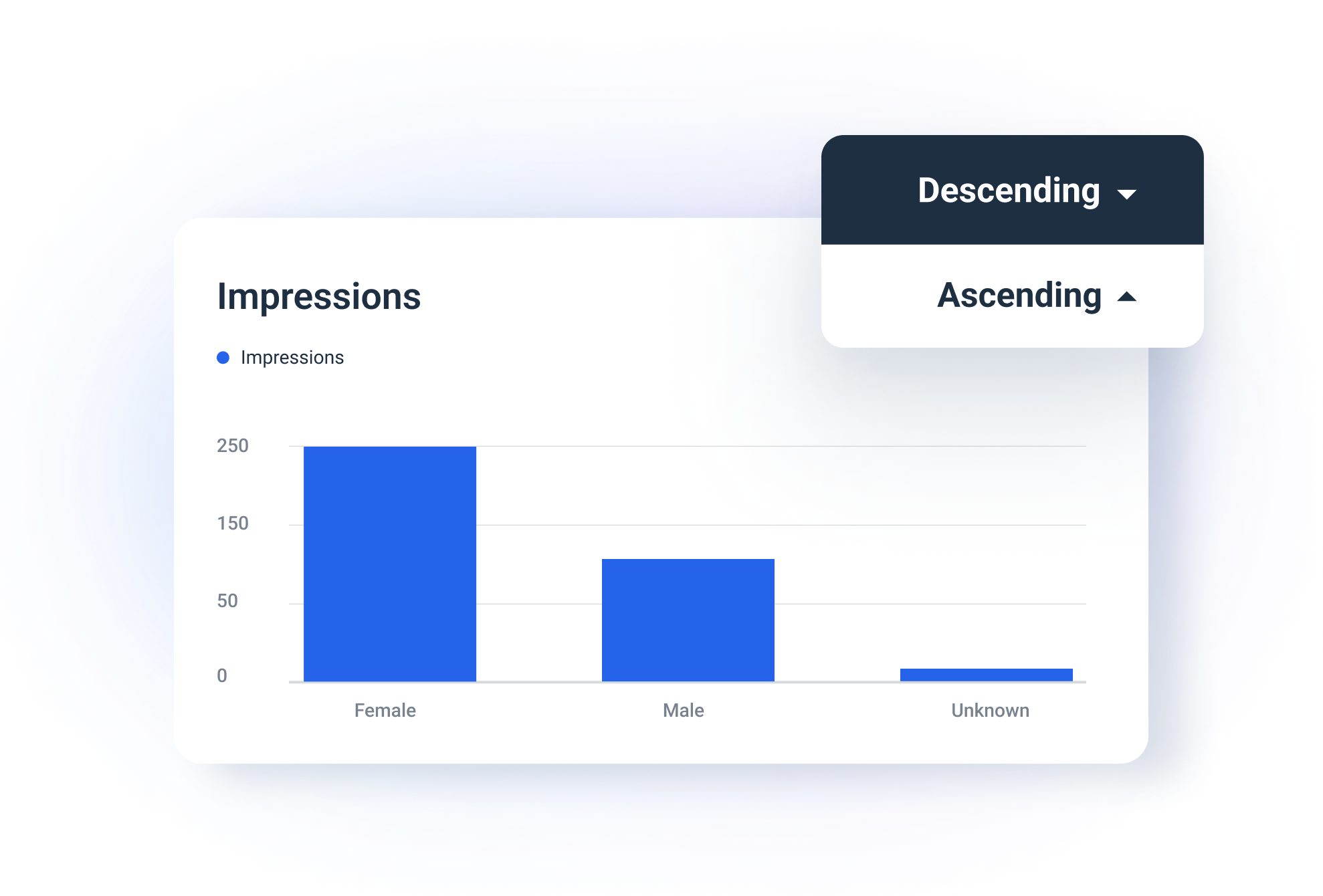
- It is now possible to add "ascending/descending" sorting to ALL widgetsincluding single-row breakdown charts. For example, if you want to add sorting to impressions breakdown by gender or similar, as in the screenshot above.
And that's only the tip of the iceberg.
We've rebuilt the widget architecture from scratch on the backend. That will bring you improved visualization capabilities shortly.
So stay tuned for more widget-related updates! And if you have any questions regarding the update, contact our support team in the Live chat.
___
P.S.
This update is being rolled out gradually across all Whatagraph users. If you are still waiting to see the mentioned features, they will appear for you in the next week or so. You will now see a
new button that enables tabs
in your report-building environment. 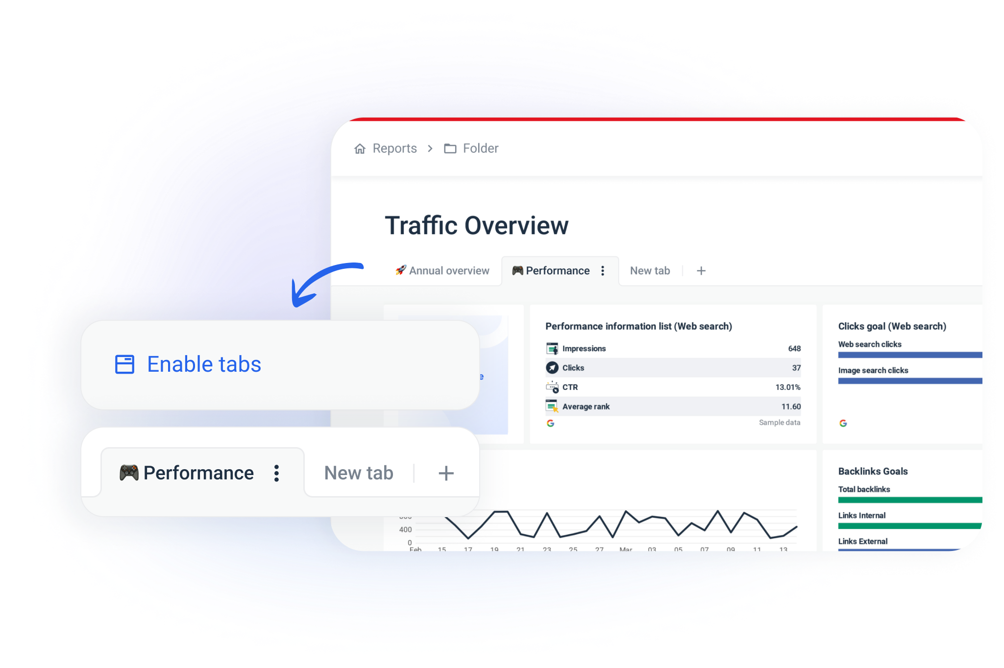
To simplify and speed up navigation in longer reports or to create multi-page dashboards you can now split information into tabs. They work in the same way as in other popular software tools like Google Sheets.
Here is a quick video walkthrough.
This update enables you:
- Create any amount of tabs.
- Name them based on your case.
- Move them to change the order.
- Move widgets from one tab to another using three dots for widget actions.
The same structure will apply if you share a link, so your readers will be able to switch between tabs in the live report.
Let us know what you think!
P.S. Don't see the update?
Try refreshing the page with CMD + Shift + RLoad More
→